

Color – The Eye of the Beholder
I wouldn’t have guessed this would be the topic of my next post. I have several bits of news and topics waiting off in the wings, but I’m very much a believer in posting updates as they become fully formed in my head and this one, like a daughter of Zeus, sprung to life fully formed in my head earlier today.
I’m often amazed how much my opinions on a subject may deviate from other people. It’s very possible a great many of you will read this and shake your heads with dismay, and not because you agree with my heresy. The subject of discussion on an art forum I read earlier today was dismay with the garish colors for some of the work on the site.
Now my first thought is that if any one should understand that art is in the eye of the beholder, it’s an artist, right? I guess not! And maybe it goes with the territory, having solid opinions on what looks right to them. Maybe I am the odd man out here in feeling that I can only answer for what I personally like.
In that light, I find myself needing to come to the defense of color. I feel like bright colors have taken a bad rap in these later years, particularly in the Western world. And for a time, I certainly would have counted myself in that camp. Imagine waking up one day to find a purple house next door? Or maybe neon lime? Horrors!
But there’s been a gradual change. Our world wasn’t always full of white and beige. Or at least people didn’t always desire it. Turn back the clock a millennium or two and things were wholly different. The materials to make the dyes for bright colors were rare. They were hard to find or manufacture. They were often reserved for people of status and wealth, if not by law certainly by sheer cost. That’s lost on us today because we look at ancient stone ruins and the color is almost all gone. I’ve seen some pretty over-the-top color illustrations for some of the ancient temples I’ve visited, but every so often, you can see the actual colors.

The above is from my trip to Egypt a few years ago. This is a roughly three thousand year old temple. Look at those vivid colors, even dulled by centuries of neglect! This is clearly an era when color was not just valued, it was a currency of its own! From ancient Rome to the Maya, I’ve seen more hints at the lost colors of the ancient world. And there’s no question in my mind we live in a comparably bland world these days. Or at least our monumental buildings are much less interesting today.
In spite of my treatise, I admit that I haven’t read tons on the subject, but I know from documentaries I’ve watched that there was a sea change somewhere along the line, where synthetic colors became easy to make and cheap and color was no longer valued. If you have to ponder how recent this was, I offer you a depiction of Queen Victoria’s Ballroom at Buckingham Palace
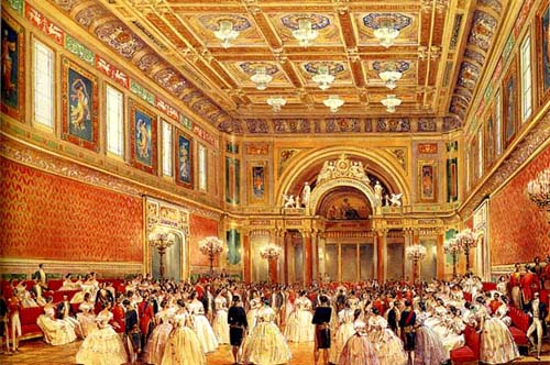
But don’t go to Buckingham Palace expecting to see this. The Ballroom is still there, But Edward VII followed along behind Victoria and redecorated the palace in cream and gold (a comparatively staid look that has stuck through today).
I’d suspect this is a visual bookmark we can place in the change from color being a status item to undesirable unless perhaps in small doses. It’s somewhere along this time period that color stopped being valued and started gathering epithets like garish, tacky, and common.
Yet nothing really changed, vast swaths of color didn’t suddenly become unsightly or tasteless. The only thing that changed was people’s expectations. The people “who matter” (and I have to put that in quotes) decided color was out and most followed for aspirational reasons.
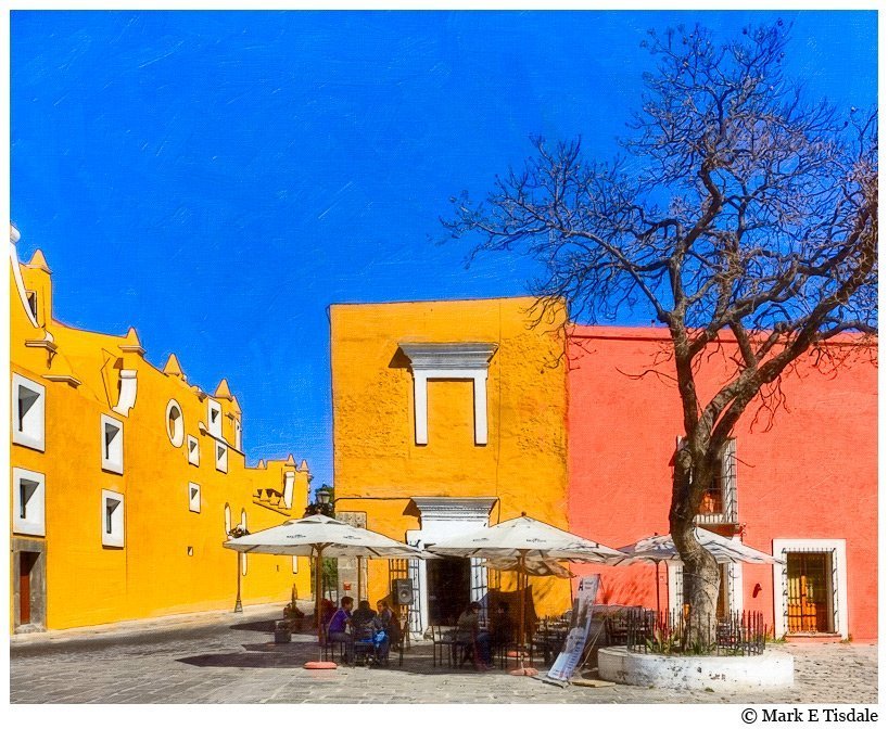
I can’t say my own feelings of color were far off. I mean, I’ve always liked bright colors to some extent but I wouldn’t have wanted to suddenly discover I lived next to a neon hued house. Then I started to travel a bit, particularly my encounters with Latin America, and I began to appreciate how cheerful color could be. I find it hard not to smile when I’m in places like this.
Now, I’m not asking everyone to make a 180 degree turn and embrace bright colors. That’s a personal thing. Do what makes you happy because life is way too short to do otherwise, but I’d just like us to all remember that one person’s tasteful is another person’s bland! And color isn’t inherently tacky; it’s ultimately a question of our individual taste. Maybe try to let a little color in if you’re willing to try, but mostly, my suggestion is let’s all quit trying so hard to be the ultimate arbiters of taste in our little corner of the world.
If you like it, love it, if you don’t maybe a little more blind eye and a little less stink eye? Heresy?